Zooming In on Chronic Absenteeism: New Interactive Tool Offers One-Stop Shop to Analyze State, Local, and School Attendance Trends
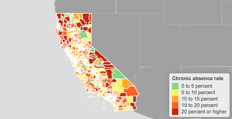
Aided by a growing arsenal of data on student chronic absenteeism, education experts released a new digital tool last week in the hopes of facilitating more in-depth conversations on attendance trends.
For the first time, an interactive map by the Brookings Institution’s Hamilton Project provides a one-stop shop for users to drill down on chronic absenteeism at the state, district, and school levels. Drawing from 2015-16 federal data, it defines chronic absenteeism as missing 15 or more days of school each year.
The timing isn’t incidental: Recent attendance trends constitute a “crisis,” according to the federal government, with nearly 8 million students reported chronically absent nationwide in 2015-16. Tracking the problem is also now part of many states’ accountability systems under federal education law, and research links excessive student absences to poor academic performance and delayed graduation.
“We need to know who is chronically absent” to properly tackle the issue, Lauren Bauer, a Brookings economic studies fellow, told reporters. “The interactive map lets everyone — from parents to policymakers — see where, and for which students, chronic absence is a challenge.”
The tool accompanies a report produced in collaboration with Attendance Works and the Everyone Graduates Center. (The report cites 10 national findings from the data, including that the percentage of schools with a chronic absenteeism rate of 20 percent or higher has increased, and that about half of chronically absent students are concentrated in schools with “high or extreme levels” of chronic absence.)
The new tool begins with a map of the U.S., revealing any given state’s chronic absenteeism rate if a user hovers over it. Maryland and Washington, D.C., reported the highest rates, at 29.1 percent and 28.7 percent, respectively, while North Dakota saw the lowest (9.6 percent). The national average is 15.5 percent, according to the latest Brookings analysis.
Here’s a brief walk-through on how to use some of the tool’s key components.
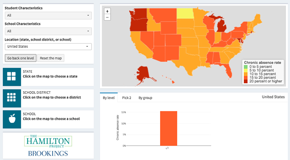
From the main map (The 74 opted to use California, which boasts the largest K-12 student enrollment in the country), users can:
1 Click on (or select) a specific state.
The map will then transform into a heat map of that particular state’s school districts.
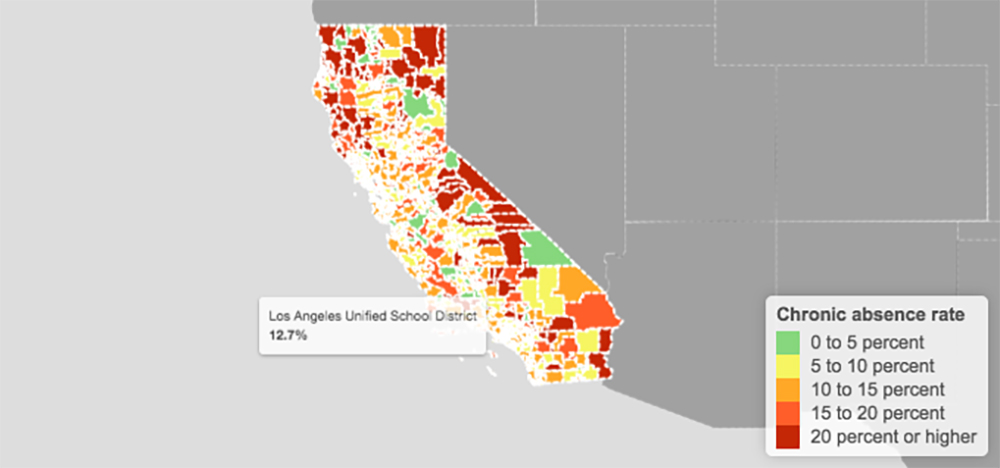
2 Click on (or select) a specific district.
The map will zoom in on that district, displaying a colored dot for each elementary and secondary school and data about their respective chronic absenteeism rates.
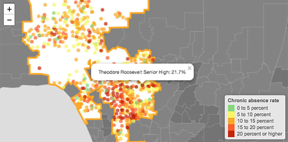
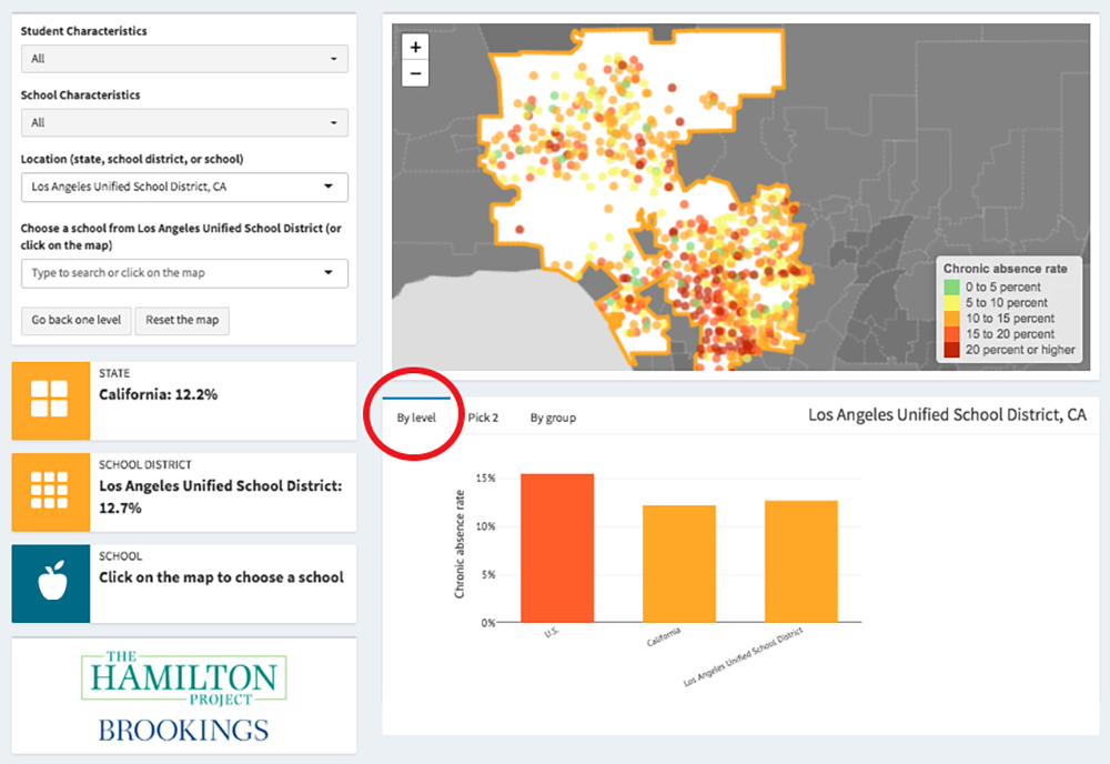
3 See the breakdown in chronic absenteeism rates by level and subgroup.
No matter whether the map is set on state, district, or school-level data, a toggle bar directly below allows the user to further dissect the data.
One option is “By Level,” which presents a comparison between the U.S. average and a selected state, district, or school.
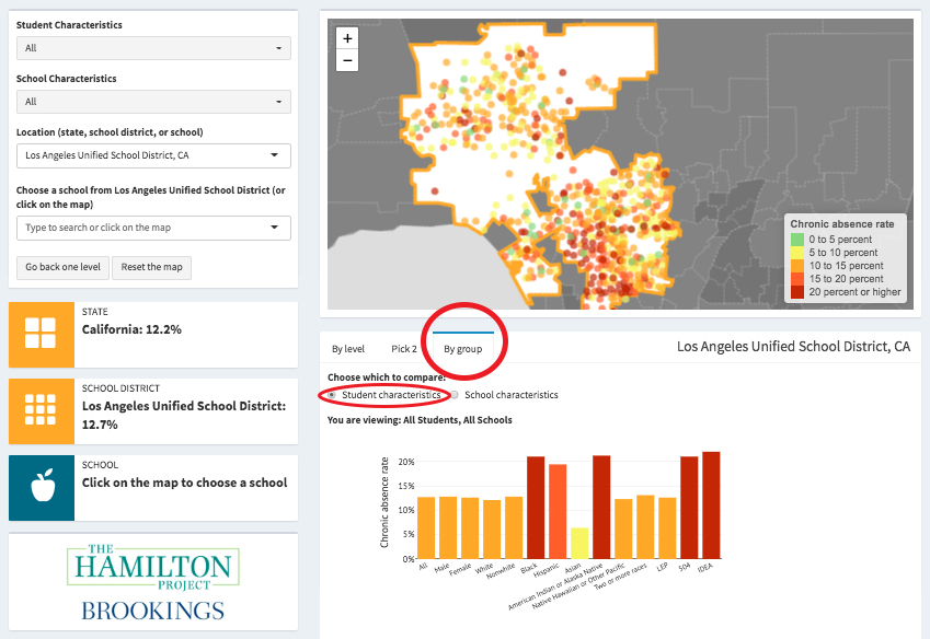
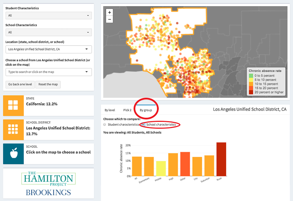
Users can also explore rates by student group under the “By Group” bar. The tool will automatically display “student characteristics,” but users can pivot to “school characteristics” to view chronic absence rates based on school type (elementary, middle, or high school) and locale (city, suburban area, or rural area).
The remaining toggle bar option, called “Pick 2,” lets the user select a particular state, district, or school and compare its chronic absenteeism rate with that of any other state, district, or school in the country.
The comparison does not have to be lateral — one state’s chronic absenteeism rate can be compared with a district or school’s rate in a different state, for example.
The map will serve “as a baseline against which newer chronic absence data can be compared in the coming years,” according to Brookings.
Get stories like these delivered straight to your inbox. Sign up for The 74 Newsletter

;)
