Analysis: Yes, Teacher Turnover Matters. But Much of What We Think We Know About It Is Wrong


;)
Untangle Your Mind!
Sign up for our free newsletter and start your day with in-depth reporting on the latest topics in education.
Updated: Dec. 27
At an event several weeks ago, the Learning Policy Institute highlighted its recent report, “Teacher Turnover: Why It Matters and What We Can Do About It.” While it’s a worthy topic, and the institute accurately diagnoses some persistent challenges in retaining teachers in certain subject areas and in high-poverty schools, the report could potentially mislead people about the true causes of teacher turnover, the likelihood of significantly reducing those rates, and the potential policy solutions to do so.
Moreover, by focusing solely on teacher turnover, LPI may be sending a misleading signal about the gravity of the problem. Although teacher turnover rates may seem high on their face, and there are certainly good reasons to want more stability, in reality teachers have lower mobility rates than almost every other profession in the U.S.
What follows is a deeper dissection of how teacher turnover rates have changed over time and some factors that are driving those changes. In addition, I present some domestic and international comparisons that should help put the issue of teacher turnover into better perspective. At the end, I argue that if we as a field misunderstand the causes of teacher turnover, we’re also likely to apply the wrong solutions.
Let’s start with the common understanding that teacher attrition* has risen over time. The graph below uses national, longitudinal data from the National Center for Education Statistics to track the percentage of teachers in a given year who leave the profession. As the graph shows, there was a general upward trend throughout most of the 1990s and 2000s, but that trend has reversed somewhat in more recent years:
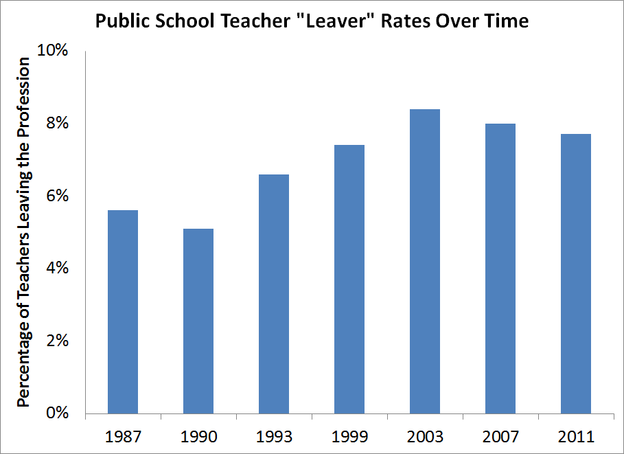
LPI’s report shows a version of this graph as well (see Figure 1, which includes both the “leaver” rate and the “mover” rate for teachers who change jobs but remain as teachers), and it’s open to different interpretations. One interpretation is that teacher turnover rates increased 50 percent between 1987 and 2003. That sounds like a lot! But another way to say it is that teacher turnover rates increased 2.8 percentage points over that period, but have since fallen by 0.7 points. All told, for the data we have, public school teacher turnover rates are up by 2.1 percentage points.
The institute goes on to break down the teacher turnover data by region, subject, poverty rates, student and teacher race, and workplace conditions, including reasons teachers themselves give for leaving. Those relationships are important, but they don’t sufficiently explain changes over time. First, the same relationships appeared in NCES’s original reports on teacher mobility back in the 1980s. And second, there are larger changes afoot that aren’t explained in LPI’s analysis.
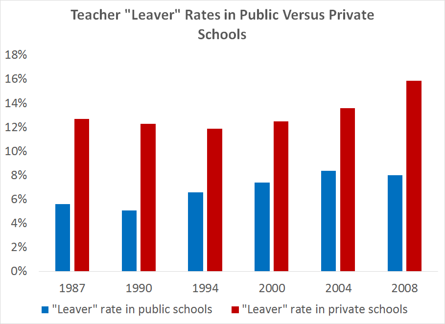
To begin with, LPI omits private school teachers. But including them would have provided more context, and their exclusion should give us pause about any potential explanations behind changes in the public sector. As the graph below shows, NCES data find that private school teachers (represented by red bars) are about twice as likely to leave private schools as public school teachers are to leave public schools. Moreover, turnover rates among private school teachers have increased even more rapidly than those of public school teachers. This throws an enormous wrench into any theory that attempts to explain teacher turnover trends based solely on policies affecting public schools.
Next, as I’ve written before, average turnover rates are partly a function of workforce demographics. Worker life cycles matter a great deal, and inexperienced workers, including teachers, tend to have higher turnover rates, as do older workers approaching retirement. All else equal, a less experienced, older workforce is likely to have higher turnover rates overall, even if turnover rates for particular groups of workers stay exactly the same.
LPI mentions these demographic forces but doesn’t dig deeper into how the changing teacher workforce could affect average turnover rates. As Richard Ingersoll has documented, today’s teaching workforce is both “greener” and “grayer” — less experienced and older — than it was in the past.
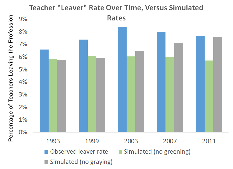
But what if the demographics in the underlying teacher workforce had not changed? What if we could isolate demographic changes that drive turnover from other potential causes? I gave it a shot. In the graphic below, the blue bars represent the same public school leaver rate data as before. But this time, I’ve added two bars signifying the “simulated” teacher turnover rate if teacher experience and teacher age had stayed constant over this time period. In addition to the national average, NCES publishes turnover rates by experience level and age, and the proportion of teachers in each group. To come up with my simulations, I artificially “froze” the experience levels and age of the teacher workforce where they were in 1987, then simulated what the averages would have been if only the underlying rates themselves changed.
This method is far from perfect. NCES reports slightly different categories for teacher mobility and demographics (for example, the mobility data have separate categories for teachers with 21 to 25 and 25 or more years of experience, whereas the demographic data have a single category for all teachers with over 20 years of experience). And ideally, a more sophisticated analysis would use teacher-level data and control for these variables simultaneously, rather than looking at them one by one. Still, it gives a rough approximation of how the turnover rates would have changed if we kept teacher demographics constant.
The results support my hypothesis. The gray bar, simulating what would have happened if teacher age had remained constant, shows as increase of 1.6 percentage points. This isn’t too much different than the actual change of 2.1 points. Changing experience levels alone account for only 0.2 percentage points, about one-tenth of the actual change. But either way, changing demographics in our teacher workforce explain some, or potentially even the majority, of the changes to average teacher turnover rates.
So far, we’ve only looked at snapshots in time, rather than following cohorts of teachers as they age into the profession. But what if we want to know what percentage of teachers reach various career milestones? That would allow a cleaner apples-to-apples comparison by looking at teachers who began their careers at different points in time. Unfortunately, NCES does not track individual teachers over long periods of time, but we can use its data to back into a reasonable approximation. (I’ve written about this analysis before, but it bears repeating here since it’s relevant to the larger turnover narrative.)
NCES breaks down turnover rates by teacher experience levels, and it updates the data with new survey results every few years. We can use these rates to synthetically “follow” cohorts as they age into the profession.
For example, NCES’s oldest teacher survey began in 1987–88. In that year, it found that 8.3 percent of teachers with 1 to 3 years of experience left the profession (meaning 91.7 percent remained). NCES’s next survey didn’t occur until 1990, so let’s assume the initial cohort of teachers had the same turnover rate in years two and three (1988–89 and 1989–90). In year four, this group would jump to a new NCES experience category (teachers with 4 to 9 years of experience). Additionally, NCES released a new set of estimates in 1990–91, so I also shift to the new estimates.
Using this method, I ran the numbers for the entering cohorts of 1987, 1990, 1993, 1999, 2003, 2007, and 2011. The graph below is the result.
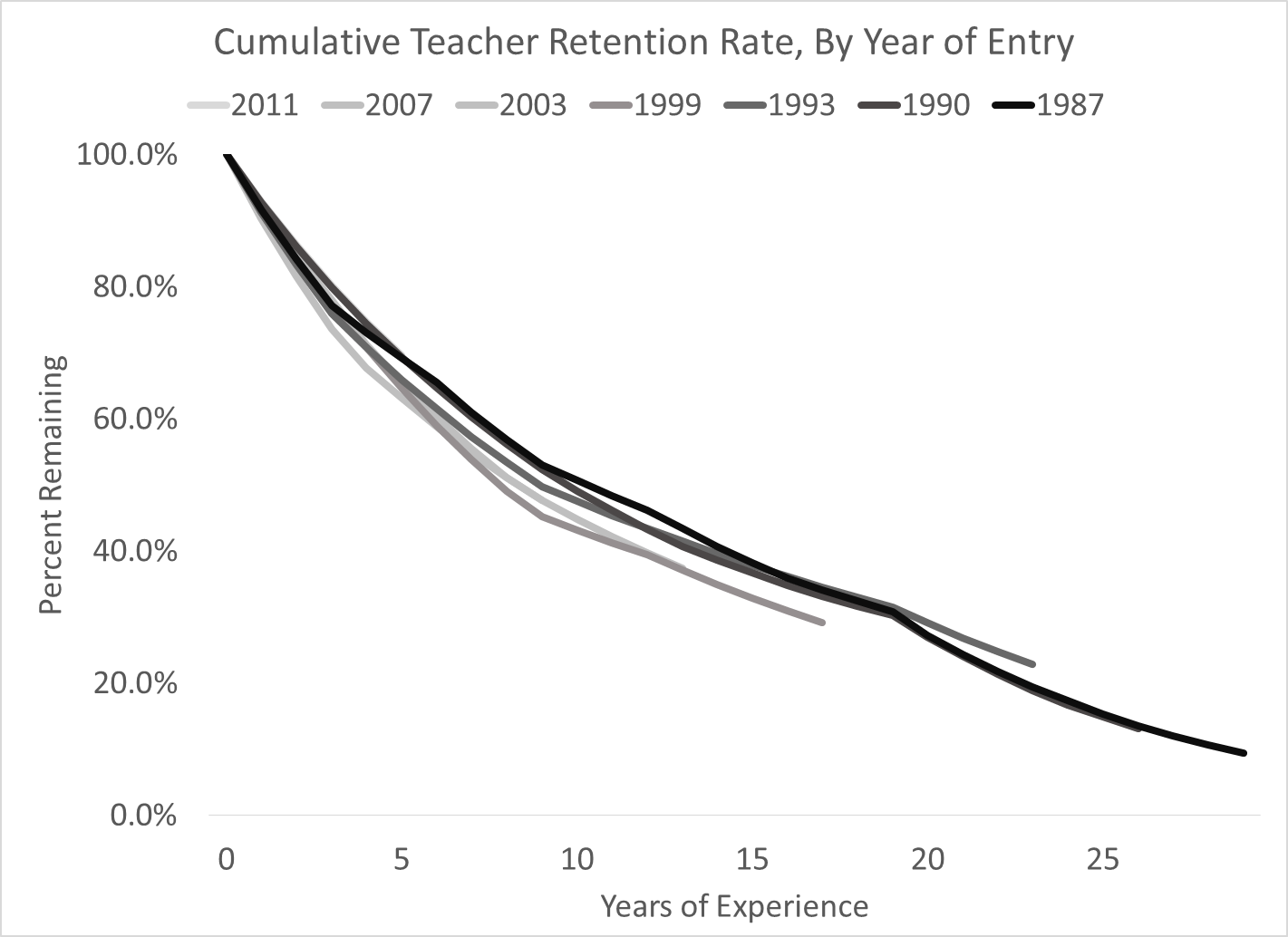
As the graph shows, there’s not much daylight between the various cohorts. Cumulative teacher retention rates don’t seem to be changing that much. Again, this is a case where a snapshot view of the national averages may be deceiving us. Regardless of the year they started, about one-third of teachers had left within five years, and slightly more than half were gone within 10 years.
That is, in any given year there are differences by subject area, geographic region, teacher and student race, etc., but they do not appear to be producing any cumulative effects on the profession. Moreover, a lot has changed in education over the past two or three decades. We have charter schools now, and new types of teacher preparation programs, and far more teachers with master’s degrees. Despite all these changes, teacher retention rates do not appear to be changing in any meaningful way.
Now let’s dig a little deeper into some of LPI’s specific claims. The report notes that “Total turnover rates are highest in the South (16.7%) and lowest in the Northeast (10.3%), where states tend to offer higher pay, support smaller class sizes, and make greater investments in education.” Although the data here are accurate, the policy analysis at the end of this statement is pure conjecture. In fact, it turns out that, according to the Bureau of Labor Statistics, mobility rates for all workers, in all fields, are highest in the South and lowest in the Northeast. (See the bottom of Tables 3 and 4 here: https://www.bls.gov/news.release/pdf/jolts.pdf.) Rather than these mobility trends being caused by some policies unique to Southern schools, perhaps there are some larger trends at play.
The same issue applies to LPI’s claim that “In high-achieving school systems such as those in Finland, Singapore, and Ontario, Canada, annual teacher attrition rates typically average as low as 3% to 4%. If attrition rates in the U.S. could be reduced by half to be more comparable with these systems, the national teacher shortage could be virtually eliminated.” This is a pretty amazing claim, to put it mildly. It’s not exactly feasible to expect that we could ever adopt all the educational policies of these countries, nor do we have any experimental evidence suggesting the low turnover rates in those countries are caused by any particular policy.
In fact, the LPI assertion may be faulty for other reasons. What if American teachers have higher turnover rates not just because of our education policies, but also as a result of being American? According to the World Bank, the average American is about three times as likely to move for a job as his or her peers in Europe or Canada. Viewed through that lens, maybe it’s not surprising or damning that teachers in the U.S. also have higher mobility rates than those in other countries. Even if we adopted all their policies, we still might not be able to cut our teacher turnover rates in half.
Finally, it’s worth looking outside the field of education. It’s true that teacher mobility, in general, is bad. It costs districts money to hire and train new teachers, and students suffer from unnecessary churn. But we also need to keep things in perspective. It turns out that American teachers don’t turn over more than other American workers. Doug Harris published a rigorous analysis in 2007 comparing teachers to social workers and nurses and did not find any meaningful differences among the three types of workers, save for earlier retirement rates for teachers. A 2012 study came to similar conclusions. A recent piece from Nursing Solutions Inc. found nursing mobility rates to be at about the same level as for public school teachers, and nurses have the same regional trends, differences by specialty area, and high costs of turnover as teachers. Not to be too flippant, but if policymakers are worried about teacher turnover and teacher shortages, they should be just as concerned with nursing turnover and nursing shortages.
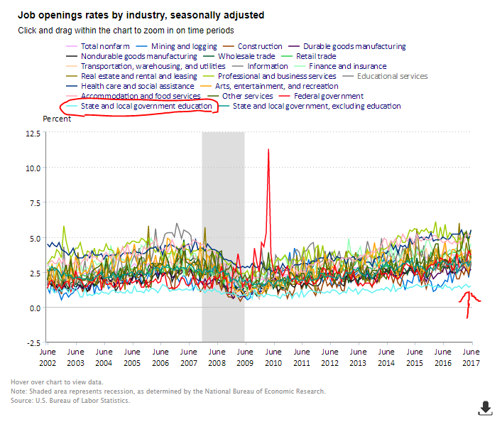
Zooming out further, national data from the Bureau of Labor Statistics suggest that public education has one of the lowest mobility rates of any field. The graph below shows job opening rates as a percentage of all jobs in the field, disaggregated by field of employment. When a worker leaves a job, or when an employer creates a job, that creates an opening for a new employee. The graph below shows the total job openings in each field as a percentage of the total workforce in that same field. Public education is represented by the light blue line, and at nearly every point in the past 15 years, public education has been near the bottom, meaning it consistently ranks among the fields with the lowest mobility rates.
Now, a natural question might be: So what? Suppose we all recognize that teacher turnover and mobility are more or less what you’d expect given broader American labor market trends. What then? We still know that churn, in general, is a problem, particularly for disadvantaged students. We still might desire a more stable teaching force, and we want our teachers (especially good ones) to stay in the profession longer, particularly in high-needs schools.
I agree with LPI on all these fronts. But we can’t address these challenges if we can’t accurately diagnose the problem. If we as a field are hazy in our diagnosis of what’s causing changes in teacher turnover rates, we’re also going to be hazy in our responses. As one example, LPI cites NCES survey data showing that teachers often list “assessments and accountability measures” as one of their primary sources of dissatisfaction. I don’t doubt that many teachers identify those pressures on a survey, but a more rigorous analysis found that No Child Left Behind had virtually no effect on voluntary teacher turnover. Moreover, the fear of rising turnover rates has been used as a justification to stop a host of reforms, including the spread of charter schools, better teacher evaluation systems, and alternative teacher preparation programs. After looking at the data through multiple lenses, it’s not clear we even have a teacher turnover problem, at least not one as severe as is commonly believed. In any case, we should be asking more sophisticated questions about where teacher churn is bad versus where it’s not.
Moreover, the “teacher turnover is rising!” mantra runs the risk of failing to recognize the real challenges faced in our nation’s schools. Instead of targeting resources at the schools, fields, and ages where teacher turnover is highest, too many efforts focus on generic efforts to boost teacher retention, like districtwide pay increases. Instead of designing solutions to fill teacher shortage areas, too many of our solutions on the supply side treat all teachers interchangeably.
If we can take down some of the fuzzy notions about teacher turnover, perhaps we’ll actually be serious about solutions designed to solve specific problems.
*Throughout the post I make the distinction between “turnover,” which captures teachers who leave the profession in a given year, and “mobility,” which includes all teachers who leave or change jobs. The former is what NCES calls the “leaver” rate. Whenever I talk about “mobility,” I’m including both teachers who leave the profession altogether and those who move jobs within it.
Get stories like these delivered straight to your inbox. Sign up for The 74 Newsletter
Chad Aldeman is a regular columnist for The 74. He writes about school finance, state assessments and accountability, and the teacher labor market. He is also the founder of Read Not Guess, a program to help parents teach their children to read
@ChadAldeman