Boston Schools Have Vowed to Combat ‘Racist’ Maps. Experts Want a Better Geography Curriculum

;)
Untangle Your Mind!
Sign up for our free newsletter and start your day with in-depth reporting on the latest topics in education.
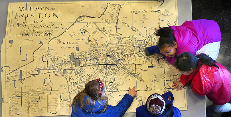
Boston Public Schools last month launched a new set of maps in their second-, seventh-, and 11th-grade classrooms designed to combat cultural bias stemming from colonialism. In reimagining an overlooked curricular asset, the move highlights a push in some districts toward what is being labeled “cultural proficiency.”
To be sure, in projecting a spherical object onto a rectangular plane, all maps invite imperfection. The most widely used school map, which virtually every American would recognize, employs a projection devised centuries ago by the Flemish mapmaker Gerardus Mercator. The Mercator projection, as it is known, made maritime travel easier by preserving angles and shapes as they appear on Earth’s surface; navigators could read a map and set their course using only a compass. It’s still helpful for getting around, which is why Google Maps uses it.

Unfortunately, the Mercator projection also stretches the area of objects as they draw away from the equator. On a typical Mercator map, Africa and South America are depicted proportionally, but northern Europe and Antarctica are magnified far beyond their true scale; thus Greenland and Africa appear to be of comparable size, when in fact, Africa is many times larger.
The problems here are political as well as aesthetic. By exaggerating the prominence of European nations in relation to lands they once conquered (the United Kingdom, for example, looks nearly the same size as its former colony of India), the Mercator projection runs afoul of some post-colonial arguments about European hegemony. Here’s a pithy take on it, courtesy of The West Wing:
Yielding to the logic of the (fictional) Organization of Cartographers for Social Equality, Boston has installed new maps using the so-called Peters projection, an equal-area depiction that the flamboyant German historian Arno Peters began promoting in the 1970s as a counterweight to what he considered cultural imperialism. Many cartographers of the period accused Peters of exploiting social justice pieties for self-promotion, and the controversy continues to this day in corners of the academic and research communities.

In announcing its decision, the Boston school district said that it was putting forth “a more culturally proficient” representation than the “biased view of the world found in traditional maps.” Colin Rose, Boston’s assistant superintendent of opportunity and achievement gaps, told the press that the decision was part of a campaign to “decolonize the curriculum in our public schools.” He added that the predominance of the Mercator projection is, in his mind, “one of the most insidious examples of how schools perpetuate racism.”
Headlines around the world have taken the same position, praising Boston for replacing “Eurocentric” materials and “amending 500 years of distortion.”
But some experts aren’t so sure.
“The school district has certainly bought Arno Peters’s arguments hook, line, and sinker, when those arguments are largely bogus,” Dr. Matthew Edney, director of the University of Wisconsin’s magisterial History of Cartography Project, told The 74. While acknowledging that an equal-area projection is “more appropriate” for conveying size and density in an educational setting, Edney also pointed to the deficiencies of the Peters projection, which distorts the shape of geographic formations in the same way that Mercator distorts their size.
“The problem is, [Peters’s] own projection sucks,” he said. “It’s ugly, right? And there are other equal-area projections of the world that are very nice. They don’t happen to be rectangular, but why should they be? The world’s not rectangular.” Pressed to name an alternative, Edney eagerly recommended several, from Johann Lambert’s 1772 azimuthal projection to a pseudocylindrical variant like Eckert IV (his personal favorite), “or even the trusty Mollweide.”

Cartography is an ancient discipline, though some of its newest tools can provide a useful vantage on the politicized debates of the past few decades. One, a popular app called The True Size Of, allows users to click on a given state or country and drag it around a Mercator map. As it travels southward, Alaska transforms from a colossus off the Pacific coast to a midsize South American country; France shrinks to fit within the Democratic Republic of the Congo.
Co-creator James Talmage helped design The True Size Of to address complaints about Mercator, but in an email exchange, he struck a philosophical note on the virtues of different models.
“It doesn’t matter what 2-D map projection you choose, you are going to make tradeoffs, and those tradeoffs will make it suitable for some studies and unsuitable for others,” he wrote. “Students need to understand the complexities of map projections, and in a sense, the larger lesson: Any data, even data so seemingly fundamental as points on a map, can be manipulated (even by people with noble intent). Question everything.”
Edney, whose own lifelong cartophilia was sparked by hours of marveling at a map of parliamentary districts in his native United Kingdom, agrees that a map rolled up over a middle school chalkboard can’t stand in for a broad-ranging curriculum.
“You get to know the geography of Asia not by memorizing the maps and place names, but by studying the history of Asia and where things come up in history and cultural studies,” he said. “That’s the kicker: More social studies, more geography within social studies, to reinforce understanding of the world.”
He’d like to see more students like himself, “map projection freaks” who obsess over the intricacies of different renderings in the way some now give themselves over to the study of typography. Of course, Edney adds, that level of scrutiny could breed as much distaste for ugly world maps as for certain unloved fonts.
“Either the Mercator projection or the Peters projection could be the cartographic equivalent of Comic Sans,” he said.
Get stories like these delivered straight to your inbox. Sign up for The 74 Newsletter
