The Fact-Check is The Seventy Four’s ongoing series that examines the ways in which journalists, politicians and leaders misuse or misinterpret education data and research. See our complete Fact-Check archive.
Are all the good schools in rich neighborhoods? Yes, says Matt Yglesias at
Vox, citing a new graph released by
Washington, D.C.’s Office of Revenue Analysis:
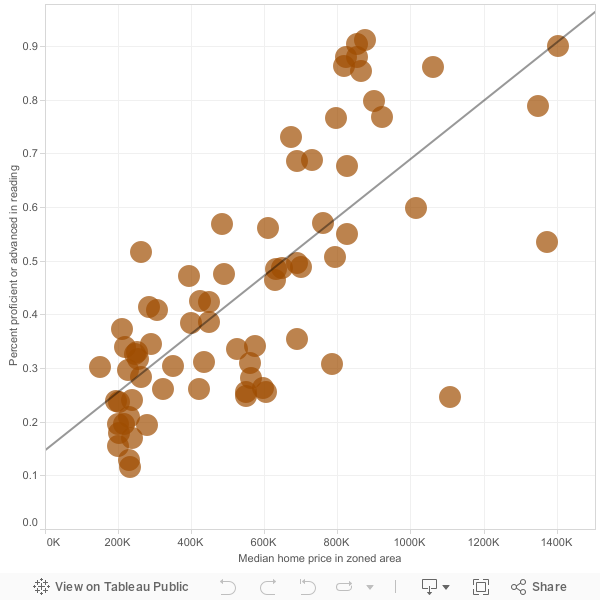
Source: D.C. Office of Revenue Analysis
The simple scatterplot shows a clear correlation between the cost of homes in D.C.’s neighborhoods and the test scores of nearby elementary schools. (For the record, this is not remotely surprising; we know that for a variety of reasons wealth is highly associated with student test scores.)
But Yglesias’ analytical reach seems to exceed his grasp when he goes on to say that this graph proves that virtually all of D.C.’s bad schools are found in cheaper neighborhoods — and vice versa. That’s just wrong.
If you’re setting out to measure the quality of a school, there are far better stats than proficiency test scores to look at. In fact, a much better indicator of school quality is “median growth percentile.” Yes, it’s a mouthful, but it measures something really important: how much progress students at a certain school made relative to other students in the district who started at the same level.
The basic principle behind median growth percentile is this: Students come into their schools at vastly different performance levels, which are often totally outside schools’ control. What schools do have significant control over is how much progress their students make over the course of a year.
While median growth percentile is still an imperfect stat (more on that in a moment), it does give us a much better idea of how schools are serving their students.
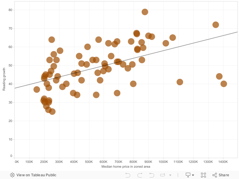
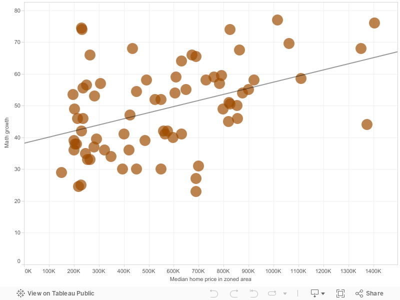
I re-ran the graph that Yglesias analyzed, this time using publicly available stats about reading growth and math growth in the same schools.1
Source: D.C. Office of the State Superintendent of Education and the D.C. Office of Revenue Analysis
Source: D.C. Office of the State Superintendent of Education and the D.C. Office of Revenue Analysis
As we can see, there is still a general correlation between housing price and student growth, but particularly for math scores, these graphs paint a much different picture of D.C.’s schools.
You will now find many schools in poorer neighborhoods demonstrating strong student growth – and in some cases outscoring wealthy neighbors. Take Mann Elementary School, where 90% of students were proficient in reading in 2014 and where housing prices are among the highest in the region; yet the school was actually a bit below average in math growth scores and about average in reading growth.
Or there’s Plummer Elementary where just a third of students were proficient in reading in 2014; yet the school ranked as 9th best in the city in reading growth scores. Different stats, much different story. Dare I say more accurate story.
Measuring school quality is extremely tricky because doing so requires isolating the school’s influence on student test scores when, in fact, most of the variation in scores can be traced back to
out-of-school factors. Using measures of growth instead is a good start, but it
might not be enough as out-of-school factors also influence how much progress students achieve in a given year.
2 (That’s why most attempts to evaluate teachers on student test scores — usually known as
value-added — measure growth while also controlling for student demographic factors such as poverty and special education status.)
Yglesias is quite right to point out the shameful fact that low-income students are often zoned into the least effective schools and taught by the
least qualified teachers. He’s also right to support D.C.’s
effective charter school sector. But the
short-sighted conflation between school performance and student performance continues to lead many policymakers and journalists astray.
In fact, it also leads many parents astray. Early in his piece, Yglesias bemoans the fact the school where he lives seems to be an outlier. “Garrison, where the reading scores are terrible and the houses are expensive anyway is my neighborhood public school,” he writes.
But I crunched the numbers, Matt, and Garrison is hardly terrible. If you had used better metrics, you would have discovered it’s just about average.
Footnotes:
1. All median growth percentile numbers came from http://www.learndc.org/. The scores are based on D.C.’s standardized test, the CAS, using 2014 data. The home price data comes from the original graph put together by D.C.’s Office of Revenue Analysis. (Back to story)
2. Another common concern about growth scores (and value-added measures) is that they tend to bounce around a lot from year to year. (Back to story)
Get stories like these delivered straight to your inbox. Sign up for The 74 Newsletter


;)